How to Switch Axes in Google Sheets
This article will provide a quick overview of how to access your axes on a graph in Google Sheets, and how to switch between which axes you are working on and editing.
In our example, we will be working with a column chart but the process is the same for any chart in Google Sheets.
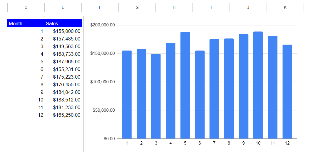
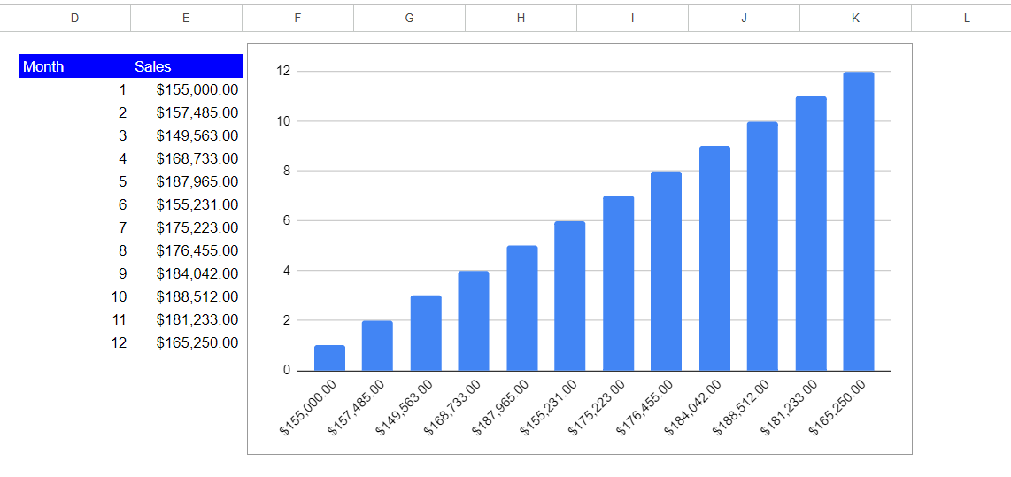
- You will see in the picture below that our column chart currently has the months portion of our data on the x-axis and sales as the y-axis. We are going to switch them in this example.
- To gain access to your axes in Google Sheets, you must first double click inside your chart. This will open the chart editor.
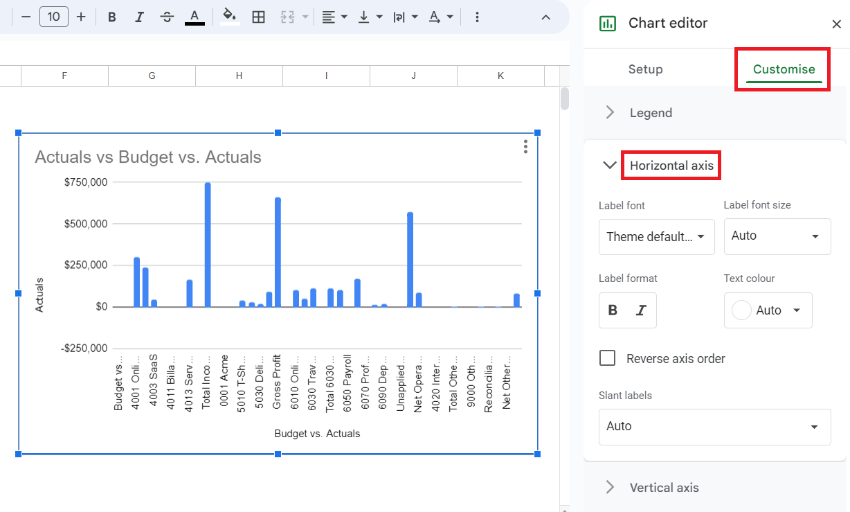
- There are two tab options in the chart editor. Sheets will automatically put you into “Setup”, to access the axes we will select the other option, “Customize”.
- To switch our axes, we will be in the “Setup” tab. In this tab, there will be an “X-axis” header with your currently selected x-axis data range underneath it. Below that will be a “Series” header with your currently selected y-axis data range underneath it.
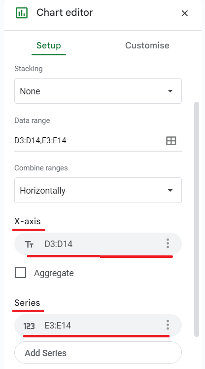
- To switch which data set shows up on each axis, you will need to delete the currently selected options and re-select them, just switched. To do this, you will need to click the three dots at the right end of your selected data and click “Remove”. You will then have the option to manually select the data used for each axis by clicking the square icon in the “X-axis” and “Series” data range selection sections.
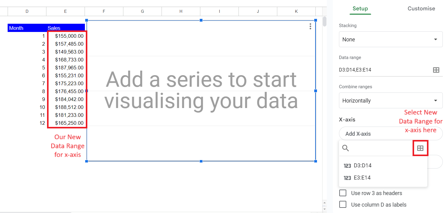
- You then repeat the same process for your “Series” section, and your axes are now switched! Your new chart will have flipped axes as shown in the picture below.
More Ways to Customize Your Axes
There are multiple customization options for your axes in Google Sheets. To edit your axes, we will once again be in the chart editor, but this time in the “Customize” tab.
- Once in the Customize tab, there will be seven options. To begin working in the axes, select the option of which axis you wish to edit. The options are listed as “Horizontal axis” for the ‘x axis’ and “Vertical axis” for the ‘y axis’.
- By selecting the axis you wish to work on, you will be able to edit several aspects of the graph. Depending on the type of graph you are working on, your options to edit the different axes will vary. Typical options include font editing, scaling options, minimum and maximum values, and slant labels.
- Once finished editing the axes, simply click the ‘x’ in the top right corner or click inside your spreadsheet and you will be out of the chart editor.