How to Make a Column Chart in Google Sheets
In this article, you will learn how to make a bar chart in Googles Sheets.
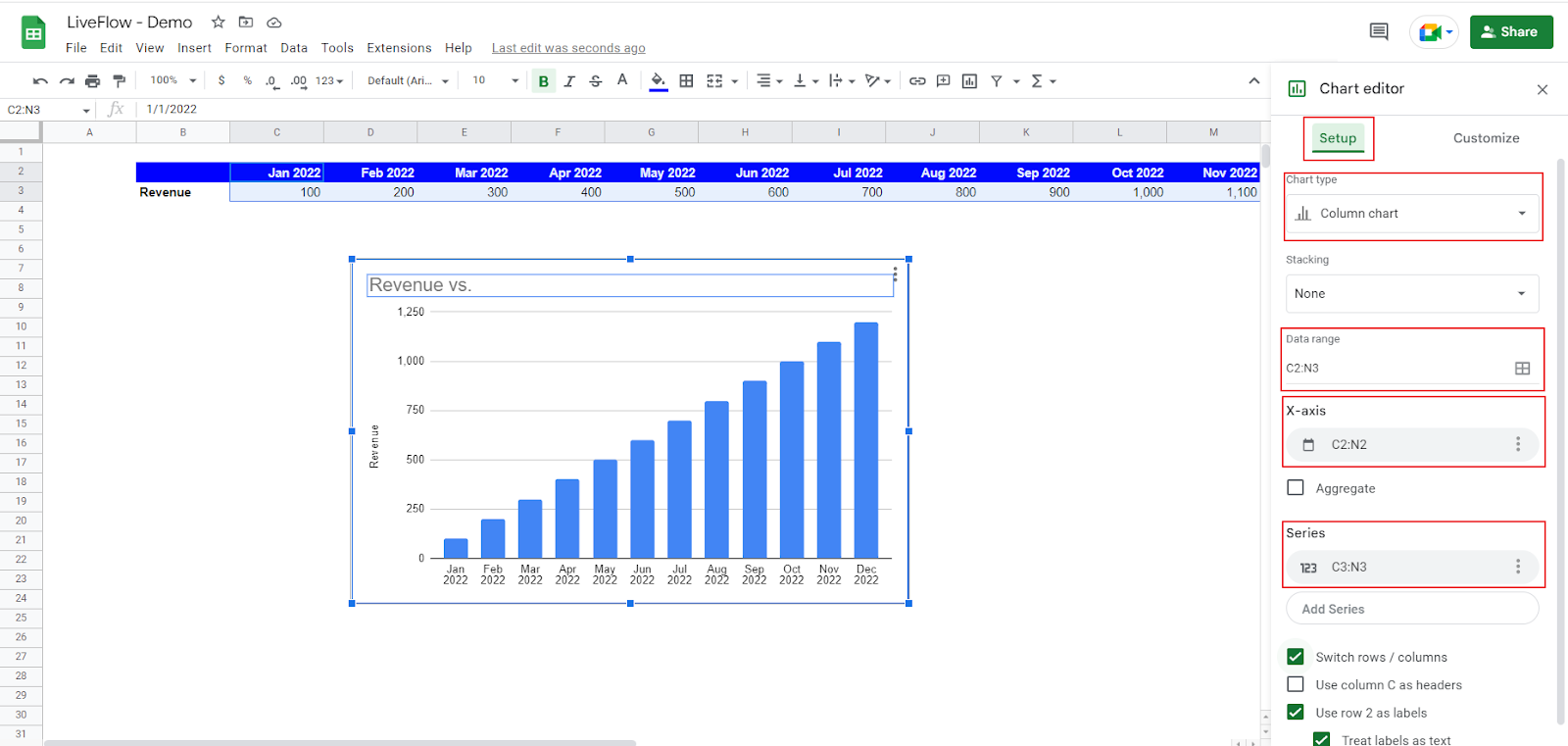
How to create a column chart in Google Sheets
- Select a series of data you want to visualize.
- Go to “Insert” and click ”Chart”.
- Then, you have a default chart on a sheet, and a chart editor shows up on the right.
- Select “Column chart” in Chart type section.
- Confirm the data range selected and adjust it if needed.
- Also, ensure the correct ranges are input in X-axis and Series sections.
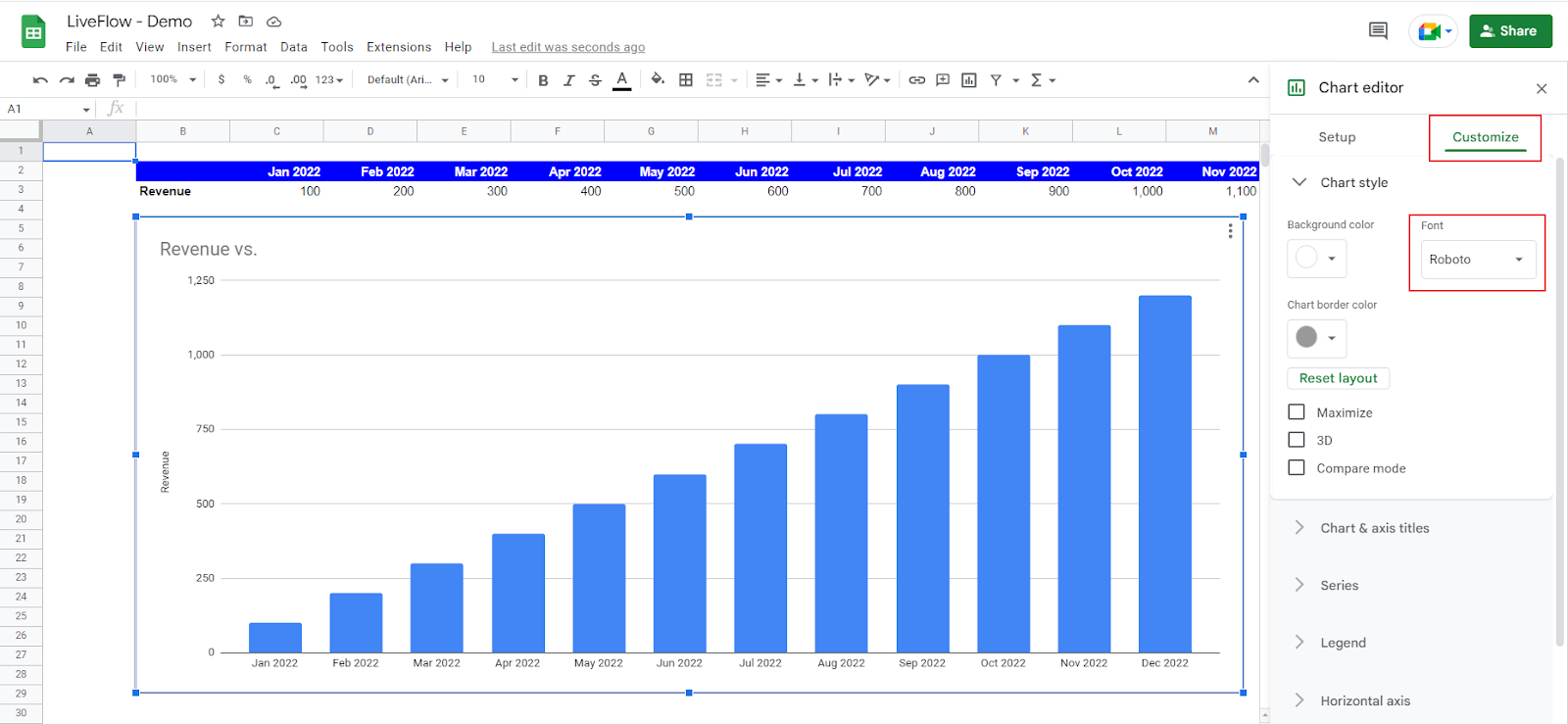
- Move to the “Customize” tab in the chart editor and customize your chart if you want.

See how to customize your chart with an example. Assume you are a finance manager and want to visualize your company's historical and estimated revenue performance in 2022 according to the company brand fonts and colors. You want to make the following changes to the basic chart you have just created:
- Change the font style to “Roboto”.
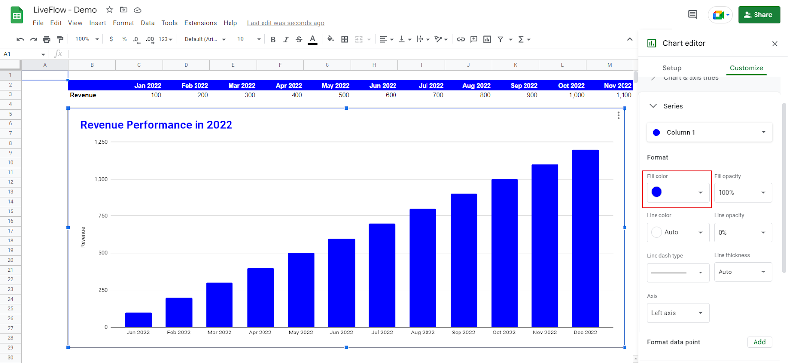
- Revise the title to “Revenue Performance in 2022”. It should be bold and colored in blue, and its font size is 24.
- Change the color of the bars to the same blue as the title.
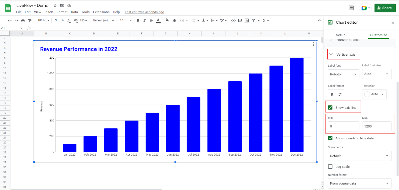
- Show a vertical axis and modify its maximum value to 1,200.
- Remove gridlines in the background of the chart.
- Add data labels.
Font style change
Go to “Chart style” in the “Customize” tab. Select “Roboto” from the drop-down list at “Font”.
Revision of the title
Go to “Chart & axis titles” in the “Customize” tab. Select “Chart title”, enter the title in the text box, change font style and color, make it bold, and change text color.

Change of bars’ color
Go to “Series” in the “Customize” tab. Select “Fill color” in the “Format” section; choose the color you want to fill in.
Adjustment of the vertical axis
Go to “Vertical axis” in the “Customize” tab. Check “Show axis line” (if unchecked as a default setting), and input specific values for the minimum and maximum of the vertical axis range.
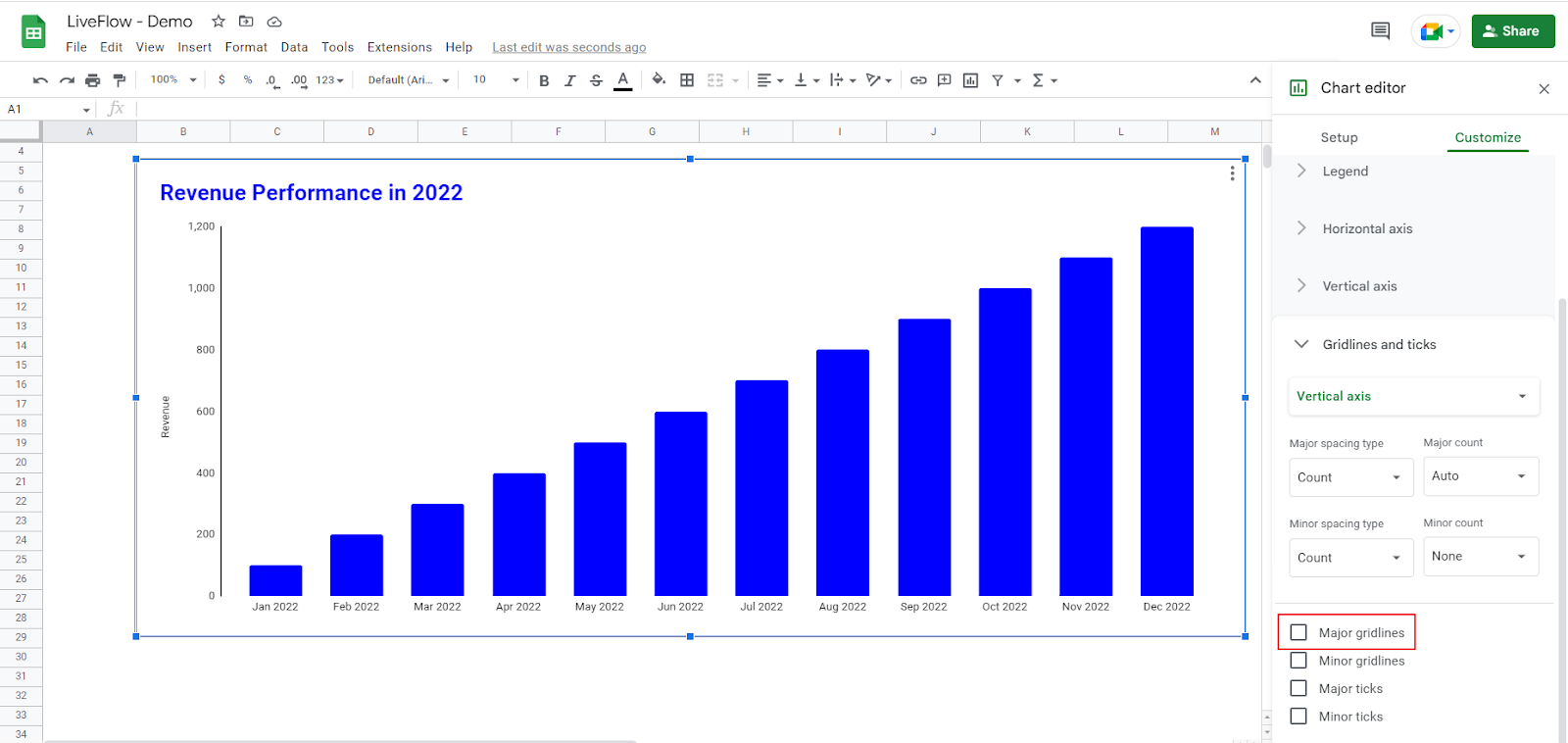
Removal of the gridlines
Go to “Gridlines and ticks” in the “Customize” tab. Uncheck “Major gridlines” (if checked as a default setting).
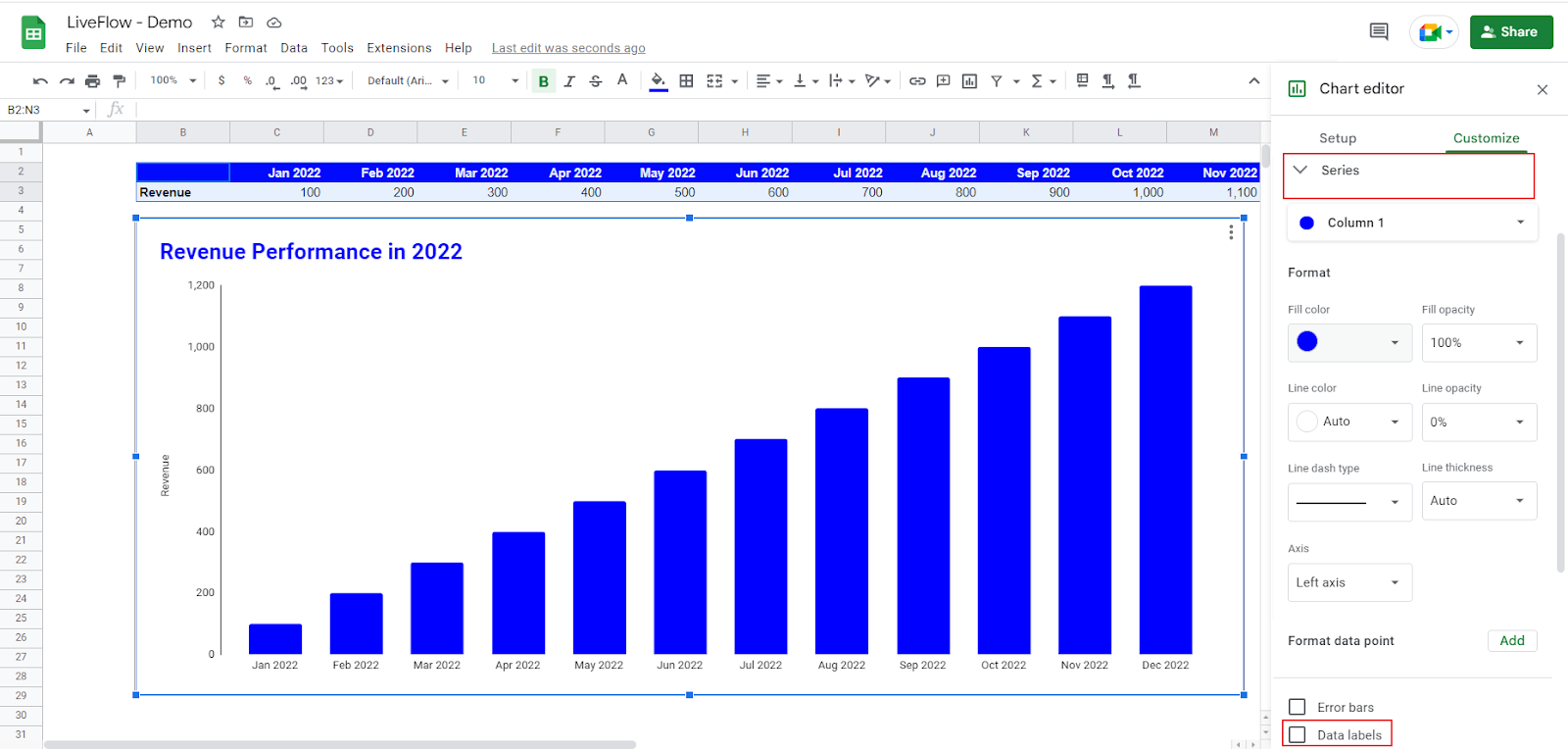
Adding data labels
Go to “Series” in the “Customize” tab. Check “Data label” at the bottom of the menu. Change “Position” from “Auto” to “Outside end”.

How do I make a stacked column chart in Google Sheets?
Check this article: How to Make a Stacked Column Chart in Google Sheets to learn how to create a stacked column chart.

