How to Make a Bubble Chart in Google Sheets
In this article, you will learn how to create a bubble chart in Google Sheets.
What is a bubble chart in Google Sheets?
A bubble chart is effective when you want to compare your data with that of your competitors from three aspects, one of which should be the size/amount to be reflected as a size of a babble (or pie) in the chart. For example, you can use a bubble chart to show your company’s position in the market, focusing on revenue size, revenue growth, and operating margin, shown as bubble size, x-axis, and y-axis, respectively.
How to create a bubble chart in Google Sheets
- Prepare a data set including four elements for series name, x-axis, y-axis, and bubble size and select it
- Go to “Insert” and click ”Chart” or navigate to the “Insert chart” icon directly.
- Then, you have a default chart on a sheet, and a chart editor shows up on the right.
- Select “Bubble chart” in the “Scatter chart” section.
- Assing proper items to each of the four fields - “X-axis”, “Y-axis”, “Series”, and “Size”
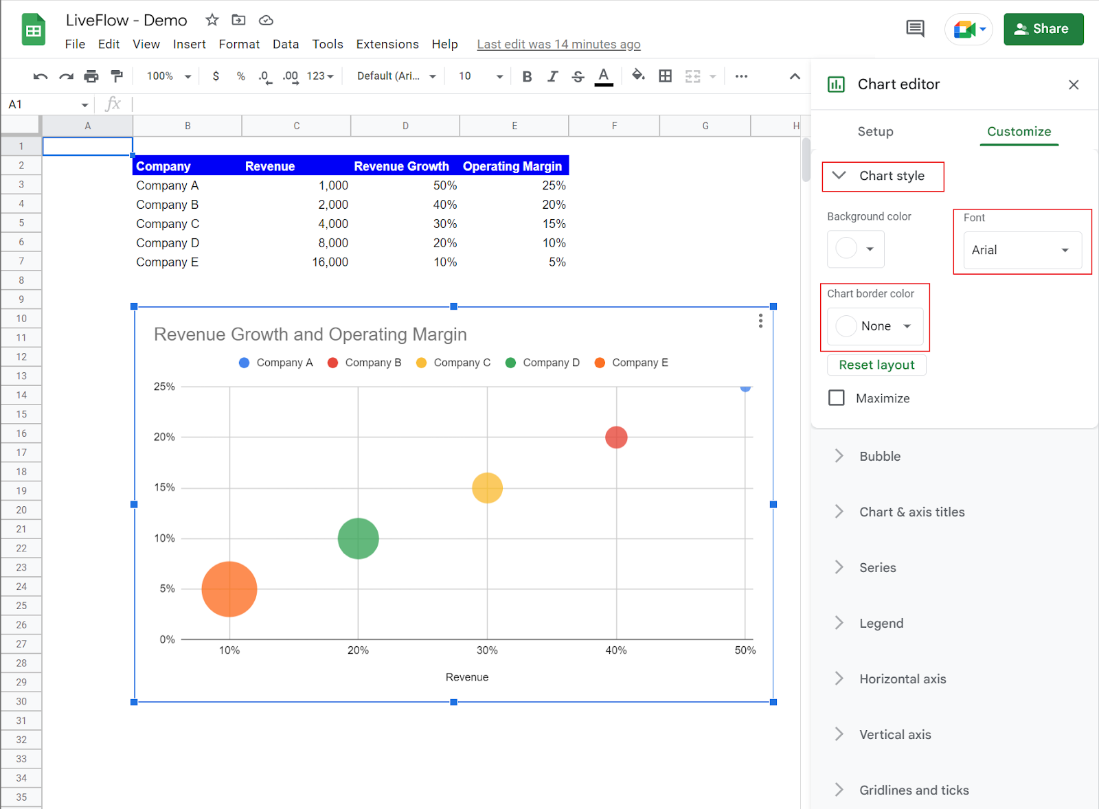
- Move to the “Customize” tab in the chart editor and customize your chart if you want.

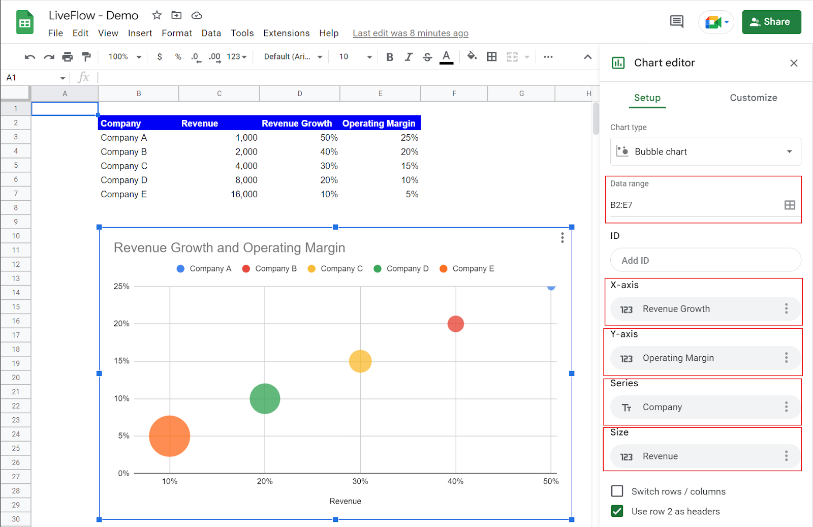
Learn how to make a bubble chart by looking at an example. Assume you have the following data set including revenues, revenue growths, and operating margins of five companies and you want to make the following chart from the data set.
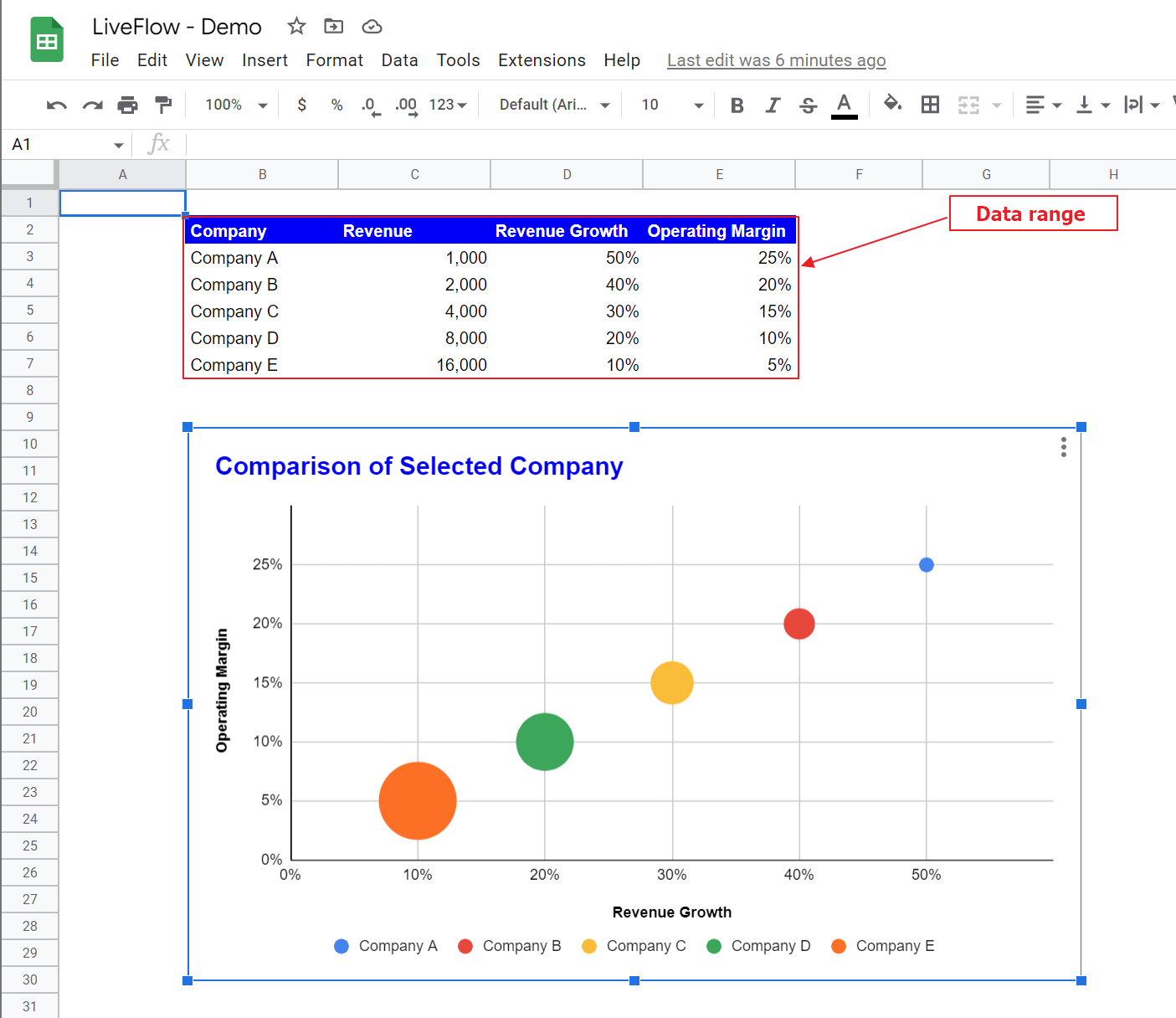
These are the steps you need to take to create the bubble chart shown above.
- Ensure the right range is selected and assign each element of the data set to a proper category in the “Set up” tab, Revenue Growth in “X-axis”, Operating Margin in “Y-axis”, Company in “Series”, and Revenue in “Size”.
- Change “Font”, and remove “Chart border color” in the “Chart style” section.
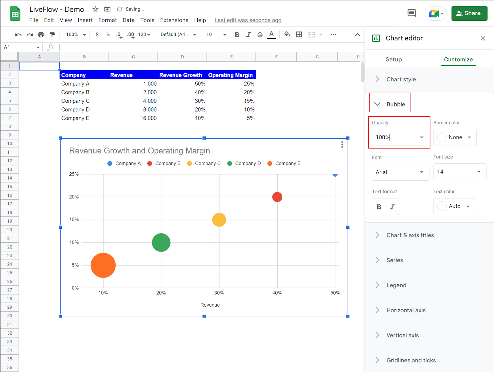
- In the “Bubble” section, change “Opacity” to 100%.
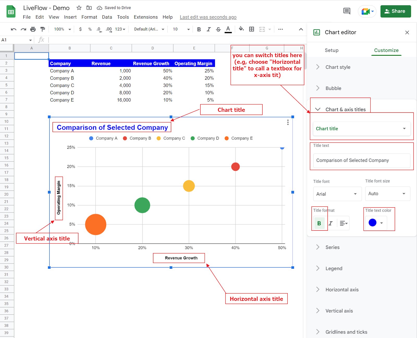
- In the “Chart and axis titles”, modify the chart title and put proper axis names for the x-axis and y-axis, and make them bold.
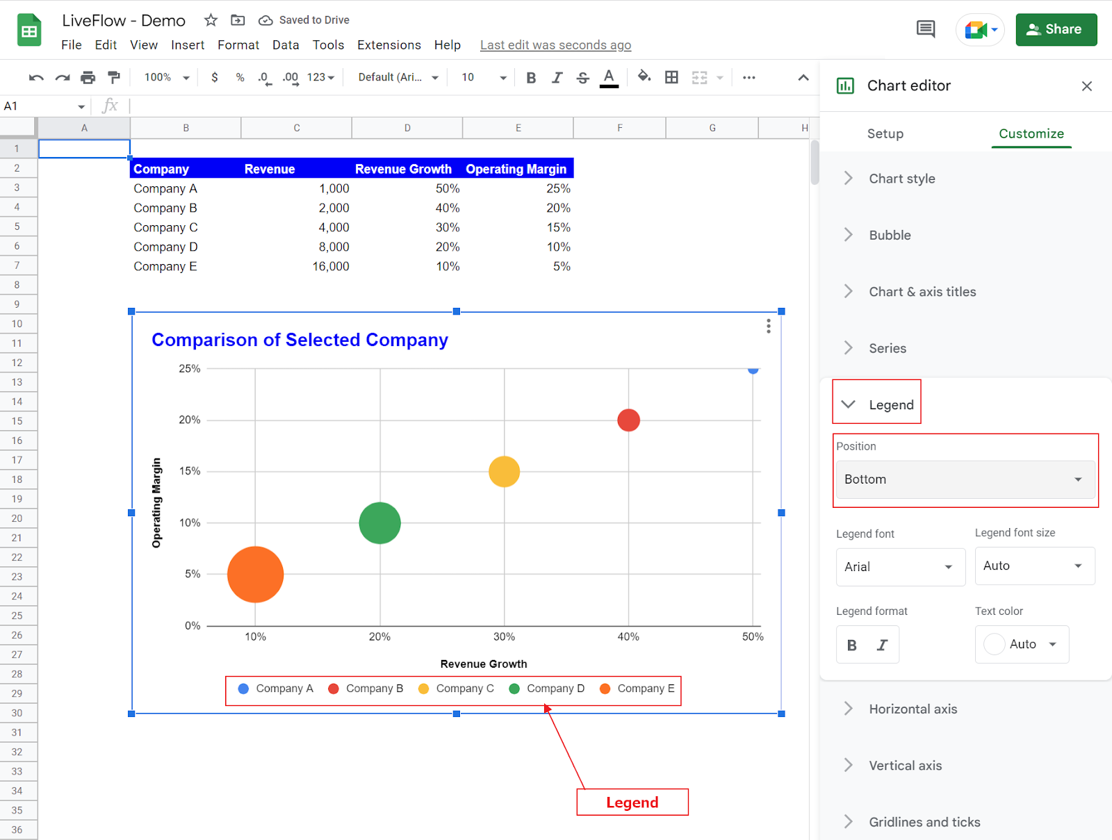
- Change the location of the legend in the “Legend” section.
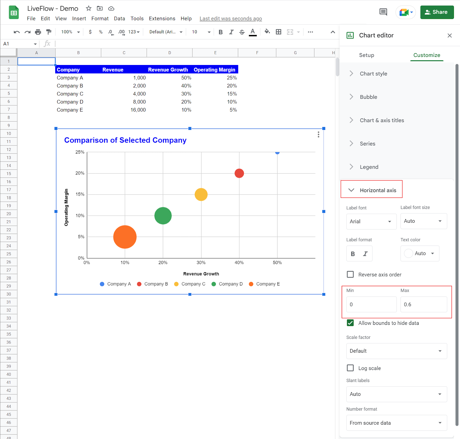
- Input the x-axis range in the “Horizontal axis” section.
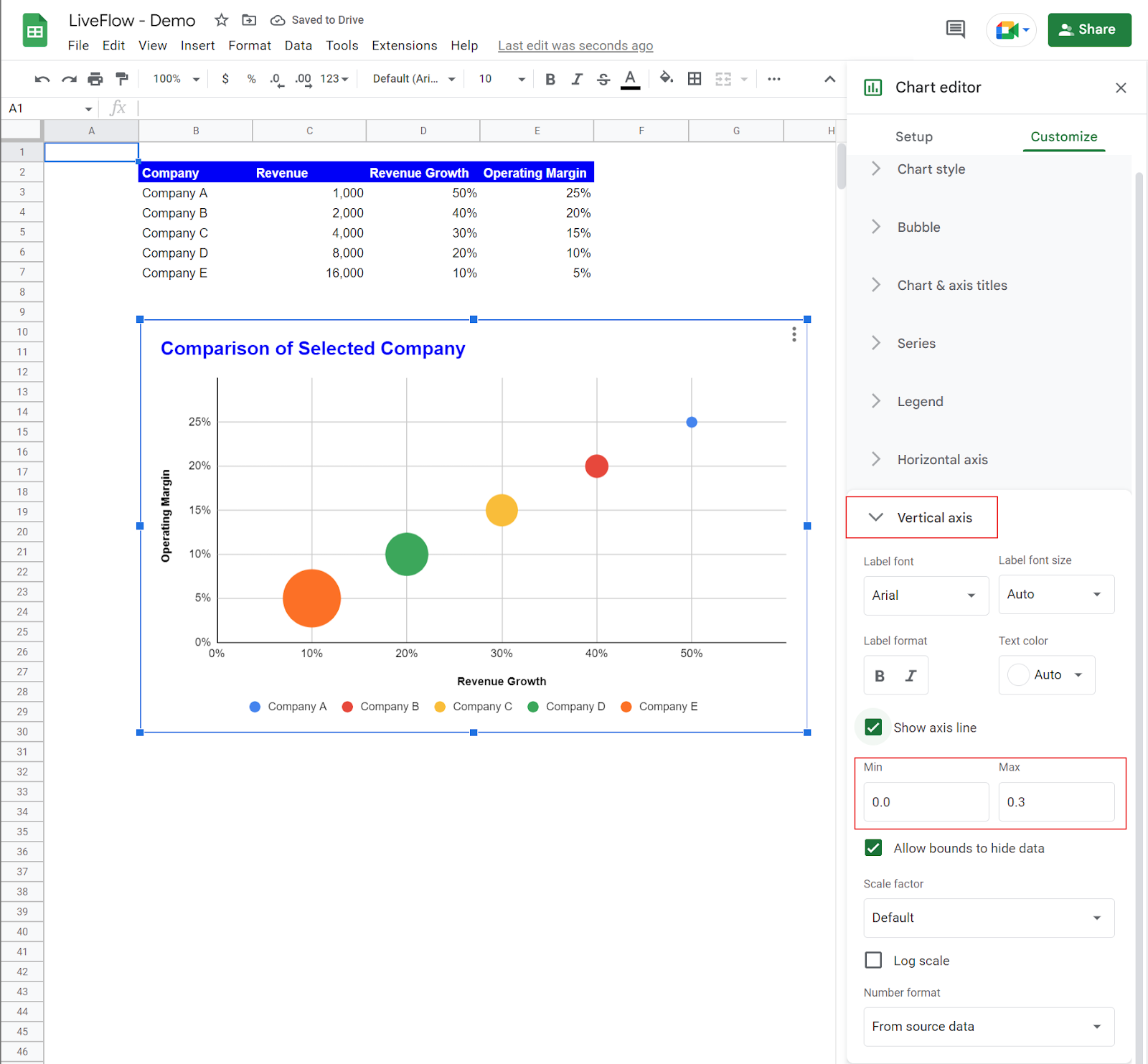
- Enter the maximum and minimum value for the vertical axis in the “Vertical axis” section.
A tip: If you want to change the colors of bubbles, go to the “Series” section in the “Customize” tab.