
How to Make a Waterfall Chart in Google Sheets
In this article, you will learn how to create a waterfall chart in Google Sheets.
A waterfall chart is effective when you want to visualize sources of a change in a key value (a bridge between FY2020 and FY2021 profits) or show a breakdown of conversion from one value to another (e.g., Revenue to Profit).
How to create a Waterfall Chart in Google Sheets
- Prepare a data set to visualize (This is the most important part!).
- Click the “Chart” icon or navigate to the “Insert” tab → “Chart”, which shows up a pop-up menu on the right side.
- Choose the “Waterfall chart” in “Chart type” at the top of the pop-up menu.
- Customize your waterfall chart.
Learn more with examples. Imagine you are a finance manager and want to visualize the following two pieces of financial information based on the data set shown in the picture below.
- A conversion from revenue to operating profit (“OP”) in the fiscal year (“FY”) 2019.
- Bridges of OPs over the last three fiscal years - which P/L item had how much impact on changes in the OPs (i.e., changes in OPs from FY2019 to FY2020, ones from FY2020 to FY2021).

A - A breakdown of Revenue to Profit flow
- Organize a series of values you want to visualize vertically or horizontally, as shown in the picture below.
- The first value in the data set should be the value you want to show as a starting point, followed by other items between the starting point and the landing point, which you want to show as a total cumulative number in the chart.
- However, you don’t need to include the landing point in the data set for a chart because you can show it by changing a setting in the chart menu. So, we don’t have OP in the data set for the chart.

- Select B9:C11 and click the “Chart” icon in the menu bar to insert the chart.
- In the “Set up” tab in the pop-up window, choose “Waterfall chart” at the “Chart type” and ensure the values you want to visualize are selected correctly.
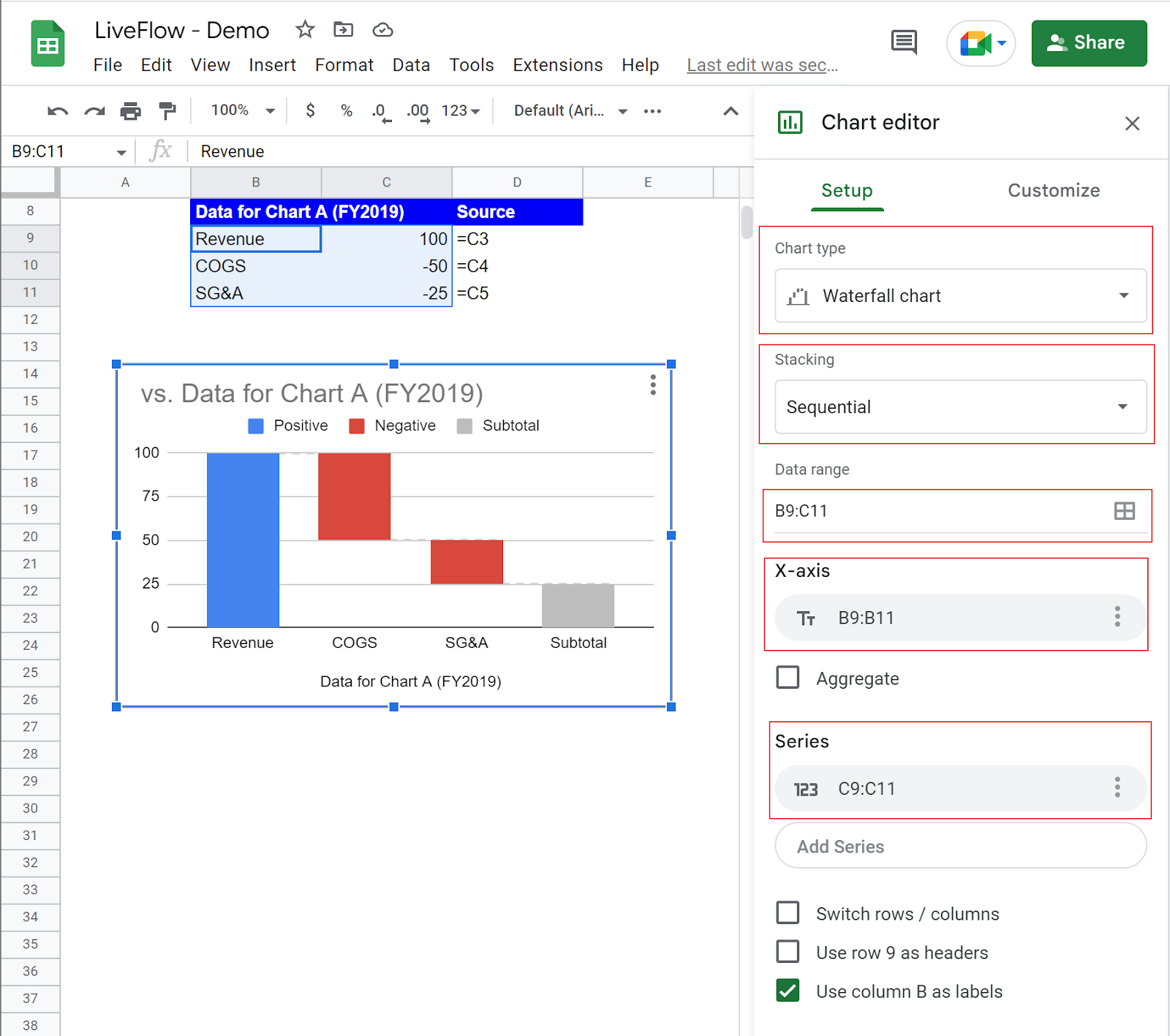
- Start customizing your chart. Assume you need to (i) change the chart title, (ii) remove the x-axis title “Data for Chart A (FY2019)”, (iii) rename the fourth bar “Subtotal”, (iv) highlight “Revenue” as starting point, (v) add a data label for each bar, (vi) change the colors of the bars, and (vii) transfer the legend to the space under the horizontal axis
- Switch to the “Customize” tab in the Chart editor
How to address (i) and (ii)
- (i) Go to “Chart & axis titles“, choose ”Chart title“ at a pull-down list, and enter the title in a text box for “Title text” beneath the pull-down menu.
- (ii) Similar to item (i), navigate to “Chart & axis titles“, choose ”Horizontal axis title“ at a pull-down list, and make it blank.

How to address (iii) to (vi)
- Move on to “Series” in the “Customize” section in the chart editor.
- (iii) Scroll down to the bottom of the “Series” section, where you can find “Add new subtotal”. Click the “Add new subtotal” button, enter the item name in “Custom subtotal label”, and select the proper location of the subtotal figure you want to show by adjusting “Subtotal type” and “Column index”. As you can see in the picture, the total cumulative figure is automatically computed and shows up in the chart.
- (vi) Click the checkbox next to the “Use first value as subtotal” to change the category of “Revenue”.

- (v) Stay in the “Series” section. Click the checkbox next to the “Data labels”, which adds data labels to the charts' bars. Make sure they are the right numbers. You can change the detailed setting of the labels under the checkbox.

- (vi) Scroll back to the top part of the “Series” section. You can see three formatting sections for “Positive label”, “Negative label”, and “Subtotal label”. Go to the “Negative label” and “Subtotal label” sections and change the fill color for each item, as shown in the picture below. (We also change the label for the Subtotal category from “Subtotal” to “Revenue/OP”.

How to address (vii)
- (vii) Go to the “Legend“ section. Select ”Bottom“ at a pull-down list named “Position” as shown in the screenshot below.

This is the end of the lecture on how to visualize a data set A mentioned at the beginning of this article. The section below explains how to create a bit more complicated waterfall chart with data set B.
We are not going to explain each step one by one as we did for data set A. We will focus on the different actions you need to take to handle data set B.
B. OP bridges over the last three years
We are showing the original financial data to remind you of what numbers we are referring to.
Look at the screenshot below.
- You need to arrange the data appropriately. Except for the starting point, OP FY2019, calculate the variance of each item for two periods (FY2019-2022 and FY2020-2021). We show which bar in the chart corresponds to which item in the chart data corresponds in the following picture.
- As we mentioned in the previous section, do not include the intermediate cumulative (OP FY2020) and the total cumulative (OP FY2021) numbers in the data set because we are going to show them by using the Chart editor’s function.
- Insert the chart once the data is well organized

- The important point in this section is that you add two new subtotals. After adding the new subtotals, enter appropriate label names and select the suitable locations for them as shown in the following screenshot.

How do I add a subtotal to a waterfall chart in Google Sheets?
We explain how to add a subtotal in detail in the section above but in summary;
- Insert a waterfall chart.
- Go to “Chart editor” → “Customize”.
- Navigate to “Series” and scroll down to the bottom of the section.
- Click “Add new subtotal”.
- Done.
How do I change the subtotal names in a waterfall chart in Google Sheets?
Once you add a subtotal as we described in the previous section, a formatting menu shows up where you can define “Custom subtotal label”, “Subtotal type” and “Column index”.
- To change a subtotal name, click a text box for “Custom subtotal label” and enter the name you want to give.
- Repeat this process for the other subtotals whose names you want to rename.