How to Make a Pie Chart in Google Sheets
In this article, you will learn how to insert a pie chart in Google Sheets.
How to create a pie chart in Google Sheets
- Select a series of data you want to visualize.
- Go to “Insert” and click ”Chart”.
- Then, you have a default chart on a sheet, and a chart editor shows up on the right.
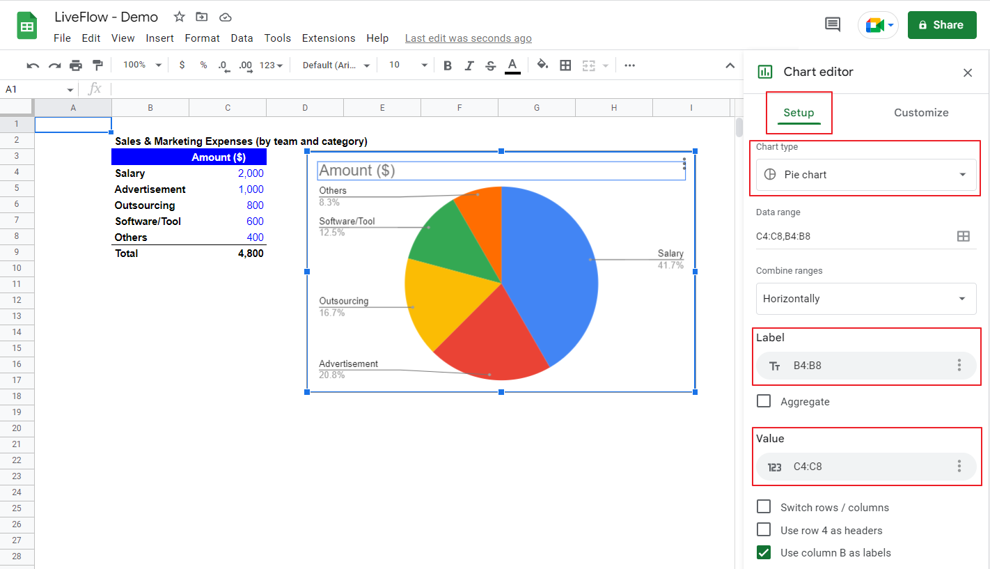
- Move to “Setup” on the chart editor, and then go to ”Chart type” and select “Pie Chart”.
- Select a range of labels (names of each category) for the “Label” section.
- Make sure that the chosen range for “Value” is correct.
- Move to the “Customize” tab in the chart editor and customize your chart if you want.
See below how to build a pie chart with an example set of data - Sales & Marketing Expenses. Let’s assume you want to show the breakdown of the Sales & Marketing Expenses by expense category such as Salary and Advertisement.
The expenses' names and the items' amounts correspond to “Label” and “Value”, respectively. The percentage attached to the chart is automatically calculated, so you don’t need to compute by yourself before you create a chart.

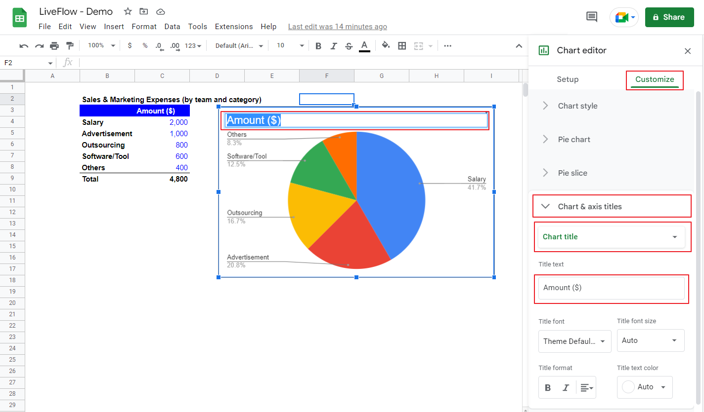
As you can see, the chart is almost done. Let’s make a couple of minor changes to this pie chart. Assume you want to change the chart title and the background of the chart, and make the background of the chart black.
- Double-click the chart title on the chart area or go to the “Customize” tab, → “Chart & axis titles”, select “Chart title” from a pull-down list, →”Title text”. Either way, you enter the chart title manually. We enter “Sales & Marketing Expenses” as an example.
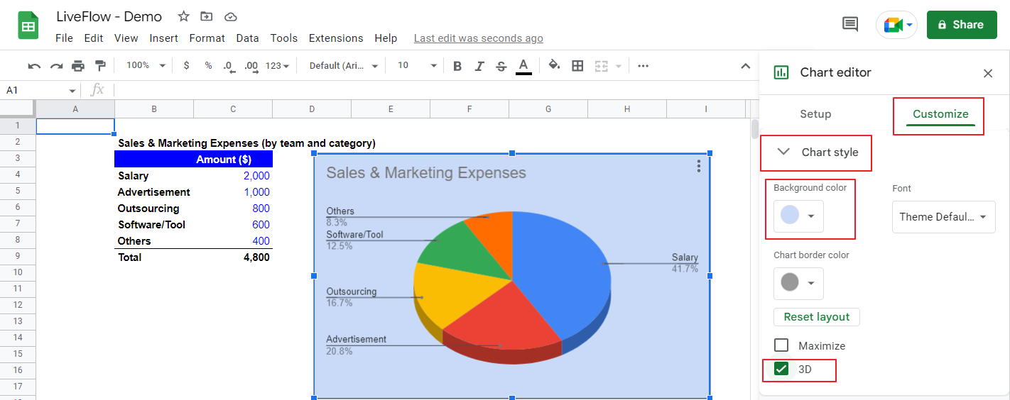
- Go to the “Customize” tab, move to “Chart style”, and select the background color you like - here, we choose a light dark blue.
- Check the box next to “3D” in the same menu.
See the two screenshots below for your reference.
How do you make a pie chart without percentages in Google Sheets?
This is one of the examples to customize your chart.
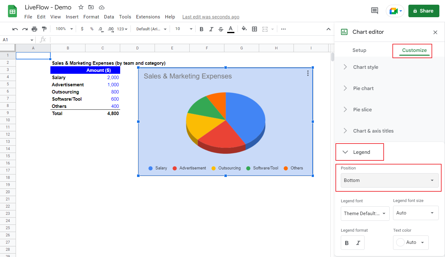
- Double-click the chart and open a chart builder.
- Go to “Customize” → “Legend", → ”Position”.
- Switch the position from “Auto” to one of the options except for “Labeled”, which is chosen as a default setting and shows percentages (and labels), if you want to show a legend. If not, you can select “None”.
- Go to “Customize” → “Pie chart” →”Slice label” where you can select which type of information you show on each slice.
See the following pictures for your reference.

How do you make a chart with data from multiple sheets in Google Sheets?
We recommend that you gather the information you want to visualize in a sheet to avoid an incorrect cell reference and increase the visibility of the data source of the chart. If you still need to insert a chart with data from multiple sheets for some reason, that is not difficult.
You need to select a range of data in other sheets when you choose or add a range of data. Make sure that the selected fields correspond.

