
How to Make a Line Chart in Google Sheets
In this article, you will learn how to create a line chart in Google Sheets. A line chart is helpful when you want to show continuous data over time, such as monthly revenue growth rate.
How to create a line chart in Google Sheets
- Select a data set you want to visualize.
- Go to the “Insert” tab and click ”Chart”, or navigate to the “Insert chart” icon in the toolbar.
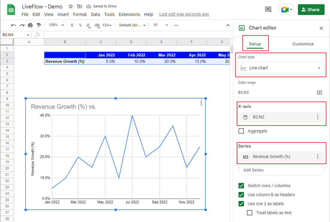
- Then, you have a default chart on a sheet, and a chart editor shows up on the right.
- In the “Setup” tab of the editor, select “Line chart” in the “Chart” type section.
- Confirm the data range selected and adjust it if needed.
- Also, ensure the correct ranges are input in X-axis and Series sections.
- Move to the “Customize” tab in the chart editor and customize your chart if you want.

Learn how to customize the design of the default chart. Assume you want to create the graph in the picture below by changing its formatting. You need to go through the steps under the screenshot.

- In the “Chart style” section, select light blue in “Background color”. Then, go to “Font” and select “Arial”.
- Navigate to “Chart & axis titles”. Choose “Chart title” in the drop-down list at the top and enter a chart title in the text box. Ensure the font is “Arial” here. Click the “Bold” icon in “Title format” and select blue in “Title text color”.
- In the “Series” tab, change “Line color” to blue, and choose “7px” for “Point size” and “circle” for “Point shape”. Check the box next to “Data labels” to add data labels.
- In the same section, scroll down to the items under the checkbox for “Data labels”. Change the position of the labels to “Left”, select “Arial” for “Data label font”, and “12” for “Data label font size”. Make their font “Bold”.
- Navigate to the “Legend” section. Add a legend by selecting “Bottom” in “Position” and make it bold.
- Go to “Horizontal Axis” and change “Slant labels” to “60”.
- Determine the y-axis by inputting minimum and maximum values for the range in text boxes.
- In “Gridlines & ticks”, click “Horizontal axis” in the pull-down menu at the top. Choose “10” in “Major count”, and check “Major gridlines”.


As you can see, there are many ways to customize your graph. Check other formats we haven’t touched upon in this example and optimize your chart for your output purpose.
How do you make a line graph with two data sets in Google Sheets?
Even if you want to create a line chart with two or more data sets, you don’t need to change the way of making a line chart based on a single data set significantly.
- Prepare data for another line. It is “Operating Margin (%)” for twelve months in the following example.
- Go to “Chart editor” for the existing chart. Include the newly added data in the “Data range”.
- Navigate to the “Series” section in the “Setup” tab, and add the additional information as another series.
- Click the second line on the graph, move to the “Customize” tab, and change the design of the added line as you did for the first line.

How to add a different scale of vertical axis for the second data set
- Click the second line you created.
- Navigate to “Series” in the “Customize” tab.
- Select “Right” in “Axis” for the second series if you selected “Left” for the first line.
- You can adjust the range of the second vertical axis in the “Right vertical axis” in the “Customize” tab in the editor.

Are you interested in creating a customized KPI dashboard reflecting your data in real time? Check LiveFlow and the following template with graphs.
Here is an example of how charts are utilized for data sharing and reporting.