

A gauge chart in accounting holds information on the key elements of a business, such as assets, sales, cash flow, income, and other specific financial facts needed to maintain an organization. This type of chart is a balanced combination of graphics and text that is often used to depict the profit and loss of the company.
In this article, we will go over what a gauge chart is, how to use gauge charts, how to create a gauge chart in Excel, and much more.
What is gauge chart?
Gauge charts are a type of chart that depict the state of an organization's finances over time. They're often used when a business is trying to measure its performance against its goals, and they can help you see whether you're on track or need to make changes to get back on target.
Gauge charts are also known as "key performance indicators," or KPIs. They're a type of visual representation that shows how something is progressing over time, and they're often used in accounting to help businesses understand where they stand financially.
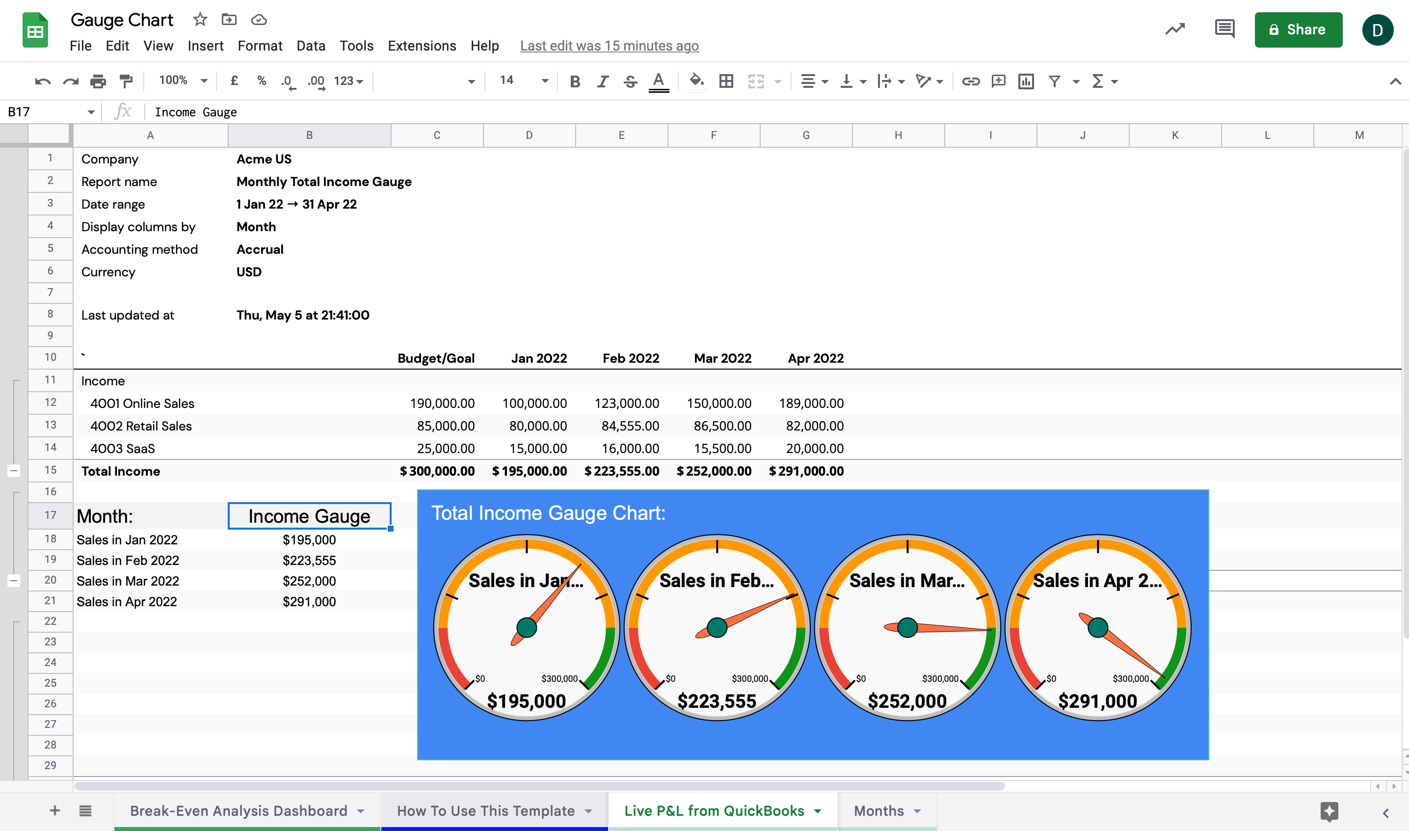
In financial accounting, gauge visualization charts are typically used to show how a company's sales are progressing over time. And just like the gauge chart analysis made with LiveFlow shown below, they are often accompanied by other types of metrics, such as budget goals, profit margins, and additional metrics related to cost or expense management, to provide a complete picture of the company's financial health.
What is a gauge chart in Excel?
A gauge chart in Microsoft Excel is a type of chart that shows the range between a minimum and a maximum value while also displaying the current value of a variable.
Gauge charts are often used to display values that are changing over time. For example, you might use a gauge chart to show how many units of product were sold over the course of a month.
How do gauge charts work?
Gauge charts work by having a series of indicators that measure how well a business is doing, such as sales volume, overall production output, or even employee satisfaction. The indicators are represented on the x-axis, and the value of each indicator is represented on the y-axis.
The idea behind gauge charts is that if all indicators are pointing in the right direction (i.e., up), then everything is going well! However, if one or more indicators start pointing downward instead of upward, it indicates that something needs to change with regards to that particular aspect of business operation.
How to create a gauge chart in Excel
The easiest way to create a gauge chart in Excel is by using the ribbon:
1. Select the data you want to chart.
2. Click on "Insert" and choose "Chart."
3. Click on "Line" under "Charts types." Then click on your data set in the left-hand side box and click "OK."
4. Drag your data series onto the chart area and resize them if necessary, so they cover all of the space between 0 and 100 (and also don't overlap). You can also change their colors if you want!
5. If you want markers instead of lines, right-click on one of your lines and choose "Change Series Chart Type." Then select either "Gauge," which will give you markers at each number, or "Temperature," which will allow you to add text labels for each number!
How do you plot a gauge chart?
Gauge charts are plotted by calculating the ratio of current figures to previous figures and then plotting the result on an axis scale.
For example, if you want to plot your company's sales revenue for last year compared with this year, you would take each year's total revenue and divide it by the previous year's total revenue (the quotient).
This will give you two numbers, one for each year, that represent how much bigger or smaller this year's sales were compared with last year's sales. To plot these figures on an axis scale, simply find where they fall on the scale for this ratio (they should fall somewhere between 0 and 1).
Summary
A gauge chart is a visual representation of a company's financial status. Most businesses use gauge charts to evaluate their performance in comparison to their competitors, industry standards, or against previous years' results.
If you want some help visualizing and managing your company’s financial data, then be sure to check out LiveFlow, which is one of the best business finance tools on the market today.


.png)


